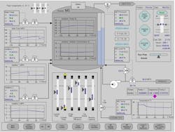
A few months ago, I posted a column covering the trend toward use of what is referred to as high-performance HMIs and away from the highly graphical HMIs that had increasingly become the de facto type of HMI screen offered since the late 1990s. From what I had been hearing for well more than a year, it seemed that engineer and operator preferences were decidedly gravitating toward the less graphical high-performance HMI.
Apparently, the jury is still out on this one. Judging not only from messages I received, but from comments posted to my article on different social media groups, it was made clear to me that many people still prefer the highly graphical HMI approach.
“We continue to struggle to convince our clients to move in this direction [toward high-performance HMIs], said John Rankin, senior controls specialist at PPS Engineers Inc., in Raleigh, N.C., in a message he sent to me after reading my column in the December 2013 issue of Automation World (this column was drawn from the blog post linked to above). “Even when I recommend baby steps in lieu of radical change I meet resistance.”
I asked John to explain end users’ resistance to the high-performance HMI concept and he said that it “has been very difficult for clients to accept the gray screen concept because it requires a paradigm shift from verifying that everything is in the right spot—where everything on the screen is green or red like it is supposed to be, to checking for abnormal situations—where everything is gray unless it is not operating as it should be.”
Furthermore, John noted that many customers have “trouble accepting the idea that the exact temperature, level, etc. doesn’t usually matter to the operator. What matters is where the level is related to control points and alarm points.” Because of this disconnect, John says these users typically demand to see the analog value in engineering units, preferring to rely on memory/prior knowledge to know if the value is “good”.
As most of us are aware due to the aging of the engineering workforce, there are fewer and fewer people in most facilities who have the experience to be able to rely on their knowledge of what is “good”. Which would seem to be another factor in favor of high-performance HMIs.
Echoing the points John made about his client’s preferences, Harold Fernandez, automation specialist at Great Ltda, in Colombia, S.A., also noted that he frequently hears comments about poorly designed or boring HMIs coming from control room operators. In his comments to my blog, posted on the ISA LinkedIn group, he said “many of us forget about the human factor, not only [in having] to respond to abnormal situations, but also having to live 8 to 12 hours a day in front of a monitor. Very often I hear operators claim: ‘I have to deal with very poor, gray displays during a regular shift of 12 hours; those screens make me sleepy.’”
Jean-Claude Chagnon, senior automation technologist at Les Consultants A.E.I., Montreal, Canada, added that he doesn’t believe graphics, color or otherwise, have any real impact on HMI performance from an operators viewpoint. He contends that it's the number of tags being displayed and the distribution in the PLC/SCADA system that has a much higher impact on performance.
“If the HMI has to make 30 reads to update a page, this will slow performance no matter what communications method is used, including Ethernet,” said Chagnon in his comments in response to my blog on the ISA LinkedIn group. “Grouping HMI data in sequential memory will optimize communications and improve performance a lot more than any increase in HMI speed. High performance and high graphics capability can be obtained with current technology by minimizing data segregation and designing HMI screens that use graphics to inform and help the operator rather than impress.”
Focusing on the operator performance aspect of this issue, John Gardner, IC&E technician at Puget Sound Energy, Goldendale, Washington, noted that the trend toward high-performance HMIs is an effort to improve the performance of the humans, not the hardware. In his post to the discussion on the ISA LinkedIn group, Gardner said, “The HMI is meant to provide operators the information they need to safely operate the plant within spec. High Performance HMI is intended to reduce the number of attention-grabbing elements on the screen (movement, color, drawings) to a minimum so that abnormal conditions can be indicated with intentional attention grabbing elements making them the first thing the eye is drawn to.”
Gardner added that one his key goals for 2014 is to “win the hearts and minds of my operators. I have an uphill battle ahead of me! We have so much screen junk (spinning fans, dancing flames, etc.) that the operators have gotten used to.”
Making Gardner’s job more difficult is the fact that many of these highly graphical screens were built by the operators themselves. “It will take some convincing to get them to admit that things could be better,” he said.
Leaders relevant to this article:


